- 1-905-452-8193
- Contact Us
- Member Login
- Get Listed Today
- 220,911 members

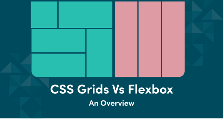
As the domain of web design keeps evolving due to the evolving needs of the users, one thing has emerged as a truth- Layout is the king. The two most significant elements in CSS layout techniques are CSS grids and Flexbox. When we study in-depth CSS Grids vs Flexbox, we get to know that CSS Grids are known to take charge in case of complex layout requirements. In this blog, we will try to understand the authority of CSS Grids over Flexbox and how they work to revolutionize layout designs.
Let’s begin!
Flexbox was formerly known as Flexible Box Layout, and it was introduced to make layout techniques simple for one-dimensional layouts. By one-dimensional layouts, it refers to those layouts that involve either columns or rows. This was indeed a major step that helped developers come out from float-based layouts and gave them a lot more control and flexibility.
According to web development companies in Florida, CSS Grids are a recent innovation that is meant for two-dimensional layouts. It addresses both rows and columns simultaneously. This brings a breath of fresh air in the realm of web design as it reshapes our thought process when it comes to structuring web page layouts. It offers unprecedented creativity and control to the developers.
When it comes to allowing control over the layout, CSS Grids excel in this. This is in stark contrast to Flexbox, which works seamlessly when it comes to linear layouts. With Grids, there is room to define complex structures both vertically and horizontally in an intuitive manner.
In this CSS Grids vs Flexbox comparison, CSS Grids outshines Flexbox when it comes to offering robust alignment and spacing features. With CSS Grids at work, you can align items in line with box axes with the bare minimum effort. Web developers in Florida are of the opinion that such a task gets cumbersome when it is done with Flexbox. More so when it comes to dealing with more numbers of rows and columns.
In this aspect of the CSS Grids vs Flexbox comparison, CSS Grids leaves Flexbox behind by quite a margin. CSS Grids are known to offer an advanced level of ease and precision, which Flexbox can never match. With CCS Grids, web developers in Florida can easily create layouts that adapt seamlessly to varying screen sizes. It makes this a perfect choice for modern and highly responsive web design!
When it comes to browser compatibility, both CSS Grids and Flexbox are well-supported across a wide range of modern web browsers. However, experts from the industry of web application development in Florida inform that when it comes to performance for complex layouts, CSS Grids win the race as they offer better less convoluted structure and optimized rendering.
Till now, we have only discussed the pros that CSS Grids bring with them. However, just like any good thing, there are certain limitations to it as well! For instance, when working with one-dimensional layouts - with a single row or column of content- Flexbox definitely comes up as a more suitable and easier choice. The simplicity it offers in managing linear layouts further makes it the best fit for small components within a webpage. These might include the navigation menus or simple card structures on the site.
Additionally, web developers in Florida are of the opinion that Flexbox is relatively easier for fresher developers due to a shorter learning curve when compared to CSS Grids. According to the top-rated web development company in Florida, it is essential to understand the specific requirements of the project clearly before selecting any of these powerful tools. If you have a layout in mind, discuss the same with your partner team of web developers in Florida, and they can guide you better in terms of selecting the right tool for the project.
The innovations in the domain of CSS layout design are evolving thick and fast, and they promise to significantly enhance the web development domain. CSS Grids are at the forefront of such evolution with the coming of subgrid capabilities. With Subgrids, there comes greater flexibility and control of CSS Grids. It allows the creation of more intricate and complex layout patterns while ensuring the coherence and performance of the site. Also, the wider support for CSS Grids ensures that there will be a bigger community for the same in the days to come, along with more intuitive implementation methods.
Web development companies in Florida believe that such progress in CSS Grids will make it even more intricate to create responsive and appealing website layouts.
By now, you understand that CSS Grids is the clear winner when it comes to the topic- CSS Grids vs Flexbox. It is due to the exceptional ability of CSS Grids to deal with intricate and multi-dimensional layouts and the degree of control and precision it offers. When there comes a requirement of a project seeking detailed alignment, spacing, and responsiveness - the standalone choice for web developers in Florida remains CSS Grids.
However, remember that the choice specifically depends on the nature of the project and the requirements. This means the selection of CSS Grids or Flexbox should never be a one-size-fits-all approach. Discuss the specific requirements of the project with your partner web development company in Florida to make an informed decision. Always remember an effective and efficient website layout is the key to a successful website!
